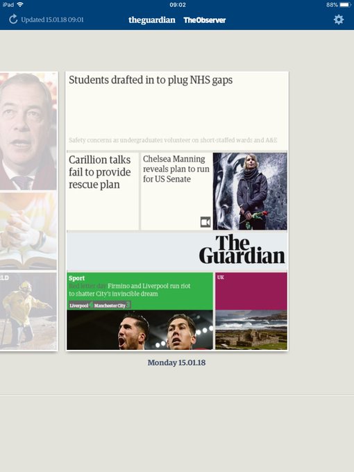
2018-01-15 (Monday)
Tweets
@rod @revdancatt @guardian I remember when BBC News first did that (1997?) and I thought they were stupid because it looked daft. A year or two later I realised I was wrong and it was brilliant.
@bfirsh Nope, exactly the same…
@chrisalexwilk I guess there’s still some changes to do to make it more in line with the new look? You must have had a busy time :)
@chrisalexwilk I did before posting, and nothing… just tried again and there it is! Good work :)
Liked tweets
Is it just me or is the Guardian redesign trailer narrated by Philomena Cunk youtube.com/watch?v=zgjoRa…
Redesign is particularly non-digital bit of thinking to bring into digital.
Facebook is never redesigned, it goes through constant evolution.
Oh well, keeps some designers busy and means there's an opportunity for a press release.
England, United Kingdom, United Kingdom


