A nice picture
There’s something appealing about images breaking down. Remember data moshing? All the rage in 2009 and which I expect will return in some form around 2030 when rediscovered.
This week I, and many others, saw this image by Diana A Smith:
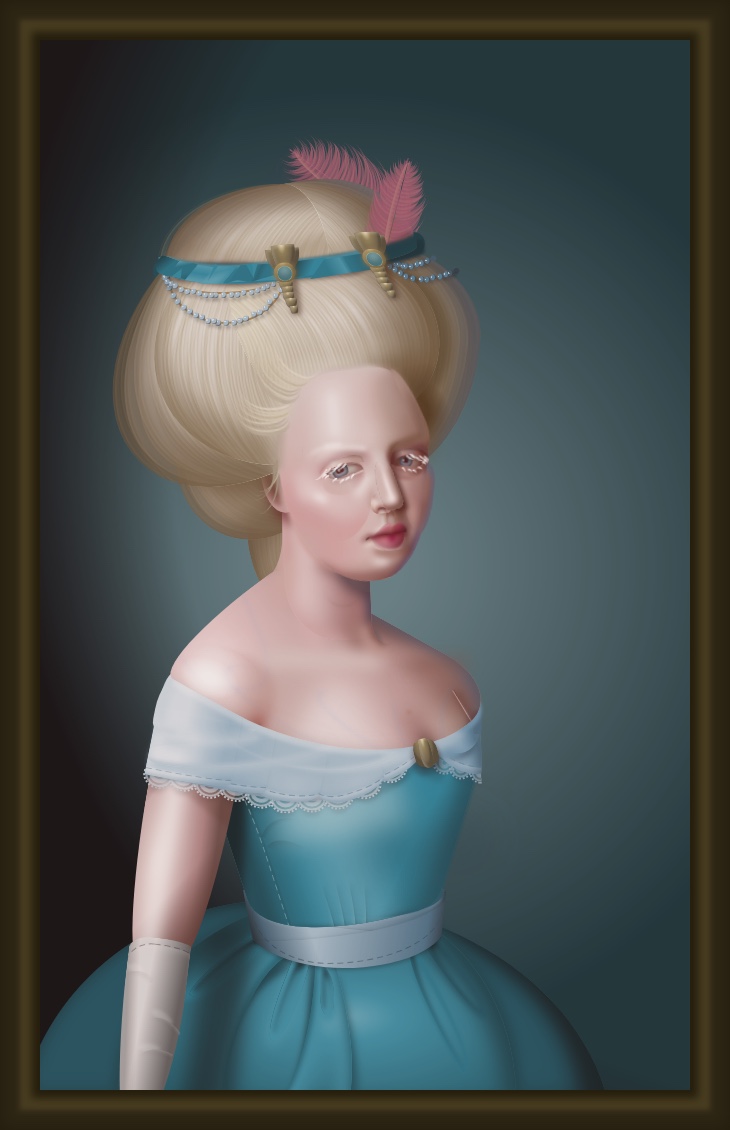
The original is painstakingly constructed using CSS, the computer language that’s normally used for assigning things like colours, styles and positions to elements of web pages.
It’s best viewed using Chrome, and starts to break down in other browsers. And it was only moments after seeing it that I saw versions rendered in older web browsers posted by Andy Baio, including:


Such interesting unintended images. As if a Renaissance painter accidentally created, as a by-product of their finished masterpiece, a cubist version of the same portrait. All very New Aesthetic I guess.
And then today I saw this Twitter thread by @RespectableLaw about the Afghan tradition of creating war rugs (lots more about that on this blog). Here’s an apparently well-known one from after the US invaded Afghanistan in 2002:

These rugs are copied over and over again, and sold as souvenirs. To quote tweets 17 and 18 in the thread:
The weavers (often children) who make the 20th (or 100th) copy have no idea of the meaning of the iconography they are reproducing.)
As a result, the original 9/11 rug has slowly turned into rugs like this:

An image broken down by a different process and, again, fascinating. I think these appeal to me because they show something beyond a simple image. Each one is the unintended result and manifestation of processes, which one can ponder, almost making the original image irrelevant. They’re something to think about and appreciate, beyond the “mere” technical skills and aesthetic achievement which, dear me, simply anyone could like! Aren’t I clever and deep!
But these also, if I’m even more honest, indicate the limits of how “interesting” I like my art to be. I have difficulty getting much out of abstract or conceptual art unless there’s something visual that immediately grabs me, or I already know a lot about what a particular artist is trying to achieve (which is rare). Fundamentally, I like a nice picture, you see.
Similarly with music: I like music that sounds “broken” and challenging, but only so long as it has enough melody and beat that I can enjoy it in a conventional sense (I’m thinking of Holly Herndon’s Platform, which I love, as I write this).
I love my avant-garde so long as it’s not too avant-garde.
All of which makes me suspect that, while I’m fascinated by early 20th century movements like cubism, futurism, dada, constructivism, etc, had I been alive then I’d have hated them. They were so different to the conventional images of the time maybe I’d have reacted in the same way as I do now when confronted with the (to me) impenetrable conceptual art in contemporary galleries.
I snootily like art and music that’s a bit difficult, a tiny part of me believing this makes me clever, but my snobbery has definite limits.
And then Sebastian Morr tweeted this image:
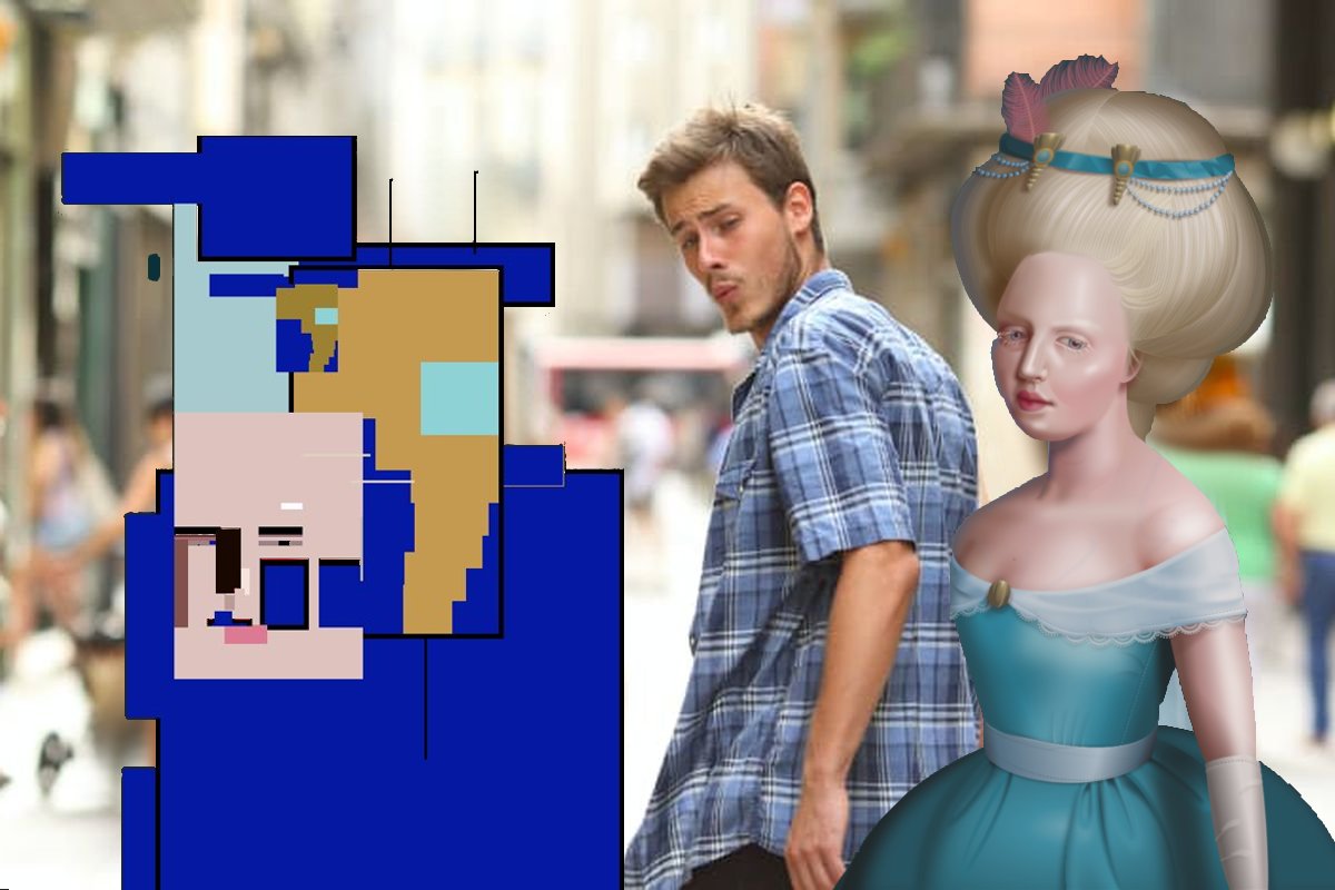
Aside from wondering how one would explain this picture with no context, I thought it skewered things nicely. Take a moment to like the thing itself.