Another year approaches, and it’s time to buy another volume of Pepys’ Diary. As usual I bought from Amazon, real bookshops never stocking the individual diary volumes. To my surprise, having bought nine previous volumes from the same publisher, in the same edition, this tenth instalment felt very different. Different as in “worse”.
Which is a surprise as the books, published in the UK by HarperCollins, look much the same at first glance:
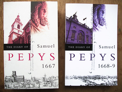
The new volume, on the right appears to be from the same edition, the only clue to a difference is that the surface is shinier and, if you look closely, the printing is a little fuzzy. There’s something of the colour photocopy about it. And, at second glance, the spot varnish on the left volume — on the solid blacks and the “PEPYS” — is missing from the right volume, where everything is uniformly shiny.
Opening the two volumes and the differences are more apparent:
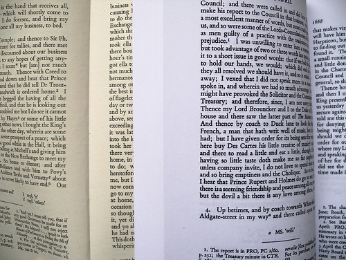
The new volume, again on the right, is much whiter. It’s only when you compare standard books with really white paper that you realise they’re usually a bit yellow, slightly textured. You might think that having whiter, smoother paper is an improvement. It’s cleaner, brighter, more contrasty, but… it feels cheap. The paper is smooth and crisp, like the kind of paper you buy in reams to feed through your temperamental inkjet printer. It’s smooth, without the grain and texture of standard book paper. It’s also thinner: text from the reverse of the page, and even from the page after that, shows through, as you can see above.
Then there’s the printing. Like the cover, there’s something slightly off about it. Not only does the paper look like slick office paper, but the printing looks like it’s been churned through an office photocopier. It looks like a photocopy of the original. Here are a couple of close-ups. First, the original, standard version:
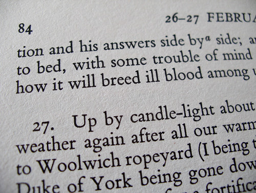
The texture of the paper is emphasised a little here and you can see the sharpness of the type. Whereas the newer version is a little different:
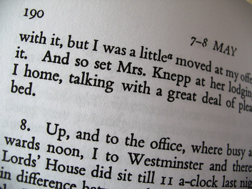
The type is thicker, not because it’s a different typeface or weight, but because it’s printed poorly. Serifs are blotchy and there are more imperfections. It looks like a copy, rather than an original. Someone laboured over that typeface, to make it work for particular kinds of printing. It’s effort that was wasted for this facsimile.
I suspect by this point you’re either thinking “That’s awful, what are publishers playing at!” or “What on Earth is the problem here? Who’d notice the difference?”
There is a difference. The newer version looks and feels inferior, cheaper, like a shoddy print-on-demand, self-published volume. And yet it costs the same and there’s no way of knowing what you’re getting. I assumed this volume would be the same as all the books I’ve bought in the same series, by the same publisher, in the same edition. But something’s changed, with no clue on the item’s Amazon page.
There are almost no differences in content between these two versions. The copyright pages of both declare them to be from the “UK paperback edition 1995”, “Reissued 2000”. But the earlier version also proudly proclaims:
Printed and bound in Great Britain by
Clays Ltd, St Ives plc
The second, shoddy version has no such statement on the copyright page. We must instead turn to a mysterious extra, largely blank, page at the very back of the book where we find an extra barcode and, embarrassedly tucked away there:
Lightning Source UK Ltd.
Milton Keynes UK
18 June 2010
So at least we know who to blame for this recent bait-and-switch in collaboration with HarperCollins.
When publishers appear to love their own books so little, when they’re apparently happy to pass off a print-on-demand photocopy of a book as a full-price volume, it’s hard for the reader in turn to feel much love for these gradually disappearing objects.
I want to love books, but if the publisher treats them merely as interchangeable units, where the details don’t matter so long as the bits, the “content”, is conveyed as cheaply as possible, then we may be falling out of love.
Comments
Commenting is disabled on posts once they’re 30 days old.


Cait at 3 Dec 2010, 12:30pm. Permalink
Whilst I have a total understanding of your point, I think the technological advances encroaching on publishing mean that unless you're happy to shell out far more than the original cost, everything save for mainstream titles will end up being on demand, most particularly when bought online.
It's a depressing inevitability. One wonders if the on-demand publishing companies will benefit to the extent that the cash available from increase in demand will mean they can upgrade their printing & come up with a better quality product. They'll only do that if the publishers demand it (on behalf of the end customer).
Without that requisite increase in quality, the product will be deemed to be worth less, (as a opposed to worthless) which will keep driving the prices down, making an increase in quality a lot less likely.
..meaning less sales, given that people will even unconsciously be feeling similarly to you. Which means the whole enterprise is screwed but then... it is anyway, really.
(Refusing to buy a Kindle for as long as I can possibly hold out)
Phil Gyford at 3 Dec 2010, 12:36pm. Permalink
That would make more sense if this cheaper-looking book actually was cheaper. But it costs the same as the older versions I have. Which is why it feels like a cheat, a bait-and-switch.
I'm not even being demanding and wanting a beautiful, lovingly printed and bound McSweeney's style interesting object... I'm not asking for better, I'm asking for the same. I don't want bog-standard plain paperbacks to be even worse than they already are.
Michael Robinson at 3 Dec 2010, 1:30pm. Permalink
You may be able to buy, or assemble, a complete set through abe.com. Some years ago now I bought a set of vols 1-X, ex library but the stamps and labels do not bother me, from Canada for under US$300 and subsequently a loose vol xi.
On I think two occasions there have been minor amendments or revisions to the footnotes in the later printings, in neither case of substance only of emphasis.
Tony Burton at 4 Dec 2010, 12:03am. Permalink
Problematically, what may have happened is that sales of the prior volumes of Pepys' diary have been so dismal that Harper Collins simply couldn't justify doing a standard print run of the book. This is a reissue, I understand from the Amazon page where it is shown. Reissued and backlist books are often printed via POD instead of offset because of the riskier nature of producing thousands of copies and warehousing them, instead of printing each book as it is ordered.
Sadly, it's the nature of the beast.
Even with that, though, Harper Collins obviously wasn't on the ball with their quality control, or those books would never have made it out onto the street. And though it seems like it should have been less expensive, by their very nature POD books cost more to produce than offset books, on a per-copy basis, so that probably wasn't in the cards.
Aaron Shepard at 4 Dec 2010, 1:37am. Permalink
The same thing happened to several children's picture books I've written: The quality went way down when the publisher put them into print on demand. This was partly because of lower standards for POD, and partly because of ignorance of how best to adjust for the new technology. I actually wound up buying reprint rights for one of the books so I could put my publisher's sloppy reprint out of print. I intend to reissue the book, again as POD -- the difference being that I know how to work with those presses to get decent color.
Anyway, the field is still new. It has made big strides in the past few years and is due for another generational change, when inkjet printers replace toner-based ones for black-and-white. So, things may improve.
Dean at 5 Dec 2010, 12:54am. Permalink
The choice for the publisher, unfortunately, is to use print on demand or to let the book go out of print. Publishers don't really like POD any more than you do, but it becomes the only alternative when a book sells too slowly to justify better printing. Offset printing yields a low unit cost, but only at printruns in the hundreds or thousands; for a slow-selling book the upfront capital cost of an offset printrun is financially infeasible.
Phil Gyford at 5 Dec 2010, 5:58pm. Permalink
That the books are printed on demand isn't the issue. I don't really care how they're printed, I care about the result and how it's marketed. If the final object is shoddy but it's sold as being the same as previous, higher-quality, items then that's not an improvement to anyone but the short-term profits of the publisher.
Birger Hartung at 7 Dec 2010, 7:18am. Permalink
As a trained pressmen and skilled digital printer I know exactly why you feel tricked. As Tony said, it's the nature of the beast: Cutting costs for production and storage.
I agree that the publisher should communicate the quality of this new edition, lining out that it's printed using POD.
Steven at 16 Dec 2010, 9:36am. Permalink
Anybody know where i can get a copy of volume 11 (index) -Lightning Source UK edition. I need this to complete my set, and i can't source one anywhere. I got volumes 1-10 from Amazon.
Ellen Dean at 21 Dec 2010, 10:33am. Permalink
I use POD (Lightning Source) and have a quality product. Using POD certainly hasn't stopped my book from selling amazingly well. It's down to the publisher what colour paper and fonts are used. Good quality control is essential - with any product.