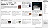
Next week I was planning on making the first steps with a side-project that maybe I needn’t bother with now. The New York Times Skimmer is pretty close to what I’ve been thinking of building for a while. Congrats to them — I only thought vaguely about it; they actually made something.
I was thinking about this area because I’m sure there must be a better way to read news online than most current news websites.
If I have a real newspaper in front of me then I’ll look through every page, time allowing. If it’s a decent newspaper then I’ll even read an awful lot of the articles. But I almost never read news online. It seems like a tedious way to read a newspaper: scanning lots of little headlines, clicking one of them, waiting for the page to load, clicking “Back” when done, finding another story to read…
I wanted an easier way to scan what’s happening today, a way that would make it feel easy to read most of the stories. The Times Skimmer is an interesting start but, for me, has a way to go yet.
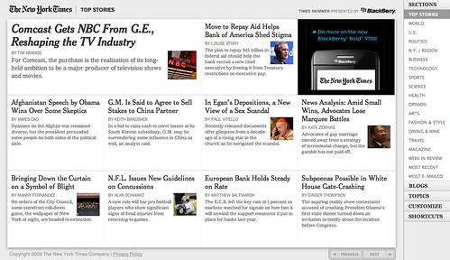
For one thing, it looks like a database. The “Customize” feature (with different designs) is great, but all of the designs are obviously automatically created. Imagine how dull a print newspaper would look if all the stories were put into regular-sized slots with no human intervention.
As a “front page” view of the news there are three things missing from this for me:
-
Importance. Tell me which events are the most important in the world today. I read a particular newspaper because I trust its instincts more than others. I want it to tell me what matters, but this is largely lost when everything is dumped into identical slots on a page.
-
Size/length. In a conventional newspaper I can tell at a glance how big a story is. The number of columns or pages it takes up is another indicator of importance, but also of complexity, and how much time I would need to invest in it. From the Times Skimmer’s grid-like views I have no idea what’s behind the links.
-
Character. In a newspaper the design of a story — fonts, photos, position, boxes, etc. — emphasise its inherent character. This is lost in an automated web page. (Although it’s also a little missing in the New York Times’ print version too, where stories differ in design rather less than in some other papers.)
While the Times Skimmer improves some aspects of reading the paper, it exaggerates the above issues, as most newspaper websites do feature a bit more character and differentiation between stories. But they still lack something to draw me into them. It’s interesting to compare the print front page, the web front page and the Skimmer:
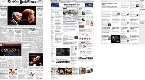
It never occurred to me before that newspaper websites don’t have story content on their front pages, whereas their print versions do. On paper I start reading a story on the front page, and might even read the whole thing there. Conversely, news website front pages shove as many headlines at me as possible and I end up reading none of the articles; all the stories seem equally small and all require a click and a page load to start reading.
Talking of which… this is something I hoped the Times Skimmer would improve on. If you click a story on the Skimmer you end up with a page that is almost the same as the conventional web page story view. Maybe this is the easiest first draft of the technology, but I’m getting increasingly frustrated with the amount of clutter around news stories online and hoped the Skimmer would have streamlined this.
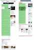
Here’s a story from the New York Times and one from the Guardian, just for comparison’s sake, with the content of the story highlighted in green:
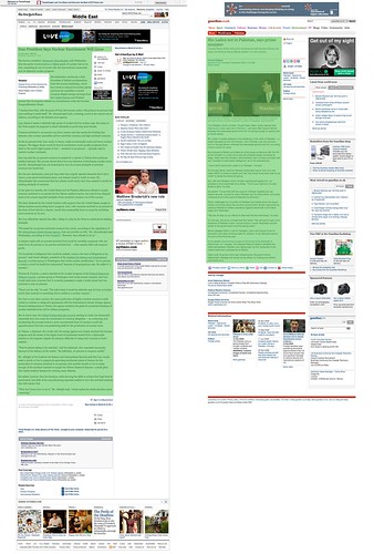
In this situation, clicking through from a front page, trying to read “the newspaper” that green bit is the only part I want to read, the only thing I want to load. Get rid of everything else. It’s all clutter that doesn’t help me in my aim of reading the paper. Keep it simple.
I’m being a bit unreasonable here. There must be some navigation in there, especially if the page must also serve users who arrive from who knows where. And I realise the adverts aren’t going anywhere in a hurry. And I know all those “social sharing” links and “most popular” stories and “special offers” and “entirely unrelated stories we’re sticking here in the hope we can eke another page view out of you” would be politically tricky to say goodbye to… too many stakeholders to satisfy and you end up with cluttered pages like these.
When I read a web page using the wonderful Readability bookmarklet, or on my iPhone using the invaluable Instapaper, I remember what it’s like to read an article without distractions. Surely newspapers should want reading their articles to be a pleasant experience? We’ve accepted that these busy pages, full of superfluous bits and bobs, are what newspapers look like online. But imagine one whose article pages featured nothing but the text, its pictures, some sadly necessary adverts and a bit of navigation. One column of easy-to-read text. Bliss.
So this is what I’m after. An online newspaper that’s as easy and as pleasant to read as a paper one. A good way to view all the articles and get a sense of their context within the day’s events. A simple way to quickly read each article without distractions. The Times Skimmer is a step in the right direction but there’s some way to go.
Commenting is disabled on posts once they’re 30 days old.