Like Russell Davies I’ve begun reading books on my iPhone using Stanza and I’m enjoying it more than I expected. I never read much on PDAs I’ve owned in the past but the iPhone’s screen is good enough, and Stanza is configurable enough, that it’s surprisingly easy on the eyes. It’s also even easier than a real book: easy to hold with one hand, easy to turn pages with one finger, and I always have it with me.
Of course, I still love real books. One of the things missing from eBooks is a sense of each book’s physical size. I bet most of us approach a book differently if it’s 600 pages long rather than a skimpy 150. But it’s hard to tell what you’re getting into on the iPhone.
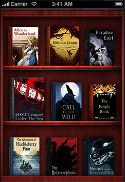
Classics, another iPhone ebook application, tries to make its books more physical by displaying them on a bookshelf:
And reading books involves a simulacrum of a page turning, complete with sound:

Very swish, although fake bookshelves and “real” pages feel like computer interfaces modelled a bit too closely around real world desks — kind of fun but a bit annoying after a while and no practical use. (Although I must admit I haven’t tried Classics.) And even with all the fancy graphics there’s no sense of the heft of the book.
Stanza, which has a larger collection of books, doesn’t attempt much in the way of physicalisation. The closest it comes is the Mac-like Coverflow view of book covers:
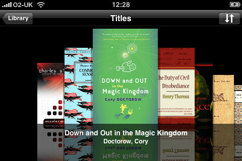
Which tells us little and, personally, I find as useless an interface for choosing a book as I do for browsing music in iTunes. Stanza’s text view doesn’t even attempt to mimic paper and allows you to adjust the font, its size, and text and background colours. Here’s how it currently looks for me:

It’s a bit of a wrench to break from the traditional view of a book after so many years but it’s quite pleasantly readable. Although so far I’ve only read science fiction on it and wonder how I’ll feel reading a one hundred year-old book in white on black Verdana.
With so much abstraction away from the physical object in Stanza I feel even more need for further cues as to the book’s nature. Stanza doesn’t even supply a page count, probably as this would be meaningless within the application — if one alters the font size then the number of pages changes because more or less text will fit on one screen (or page).
As someone who habitually looks at the number of pages in a book when I start to read it I want to know what I’m getting into. It takes me a disappointingly long time to finish most books, and I always finish what books I’ve started, so I want to know what kind of commitment I’m making.
The best solution I’ve thought of so far is for Stanza (or Classics or whoever) to create a fake 3D image of a book. Take some careful photographs of books of different thicknesses and then superimpose the existing cover images on top of the appropriate photo for the length of the book. Maybe a bit more cleverness to mock up a spine using the book’s title and author and you’d get something like this:
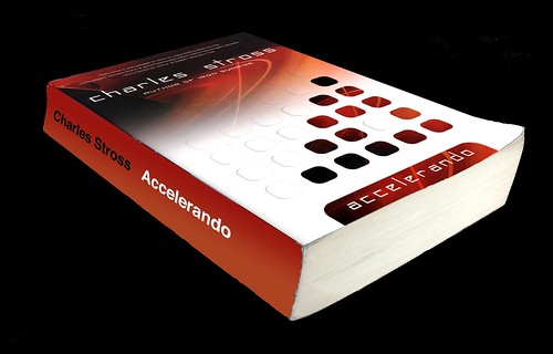
Which is obviously going to take longer to get through than this:
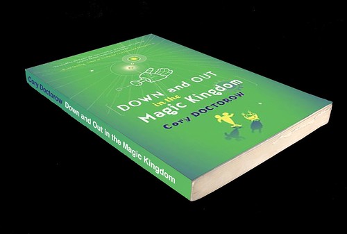
There will be extra points awarded for showing wear and tear on the virtual book after it’s been read.
I don’t think this falls into the trap of painstakingly recreating reality for no real function, like Classics’ bookshelf and page turning. The 3D image has no function as such — we don’t have some fake 3D hands that pick it up and open it where you left off (please, don’t). Instead it’s providing information rather than functionality, information that we can understand at a glance.
And it would help me work out whether I’ll be spending weeks or months reading the next on my list.
Comments
Commenting is disabled on posts once they’re 30 days old.


Michal Migurski at 30 Dec 2008, 7:17pm. Permalink
White crease marks on the spine to indicate pages lingered on would be awesome. And dog-ears.
giles at 30 Dec 2008, 11:15pm. Permalink
Interesting stuff, Phil. I'm extremely impressed by Classics, for many reasons, but the main one is this: it is the first software that has enabled me to read a whole book electronically ("Call of the Wild", since you're asking). I've tried lots of ebook apps on different devices and platforms over the years, but never got through an entire book until I tried Classics.
Mark Fowler at 6 Jan 2009, 8:57am. Permalink
While virtual hands opening where you left off would be overkill, a bookmark showing how through the book you've got would be a welcome feature too...
Phil Gyford at 6 Jan 2009, 9:01am. Permalink
Yes, definitely Mark. Stanza only has a slider that shows me how far I am through the current chapter, and this always leaves me feeling a bit in the dark about where I am in the whole book.
Tom Coates at 7 Jan 2009, 3:45pm. Permalink
It seems to me that it might be difficult to get the 3D representation of the book into an interface as small as the iPhone's, but it occurs to me that you could probably take advantage of the touch interface and the different aspects of the screen. Possibly people are thinking about this the wrong way around. Potentially the right way to look at the book would be side-on. Just show the spine, complete with branding etc—in a shelf format. Click on the spine (width representing, as you say, how long the book is, potentially with a mark on the spine indicating how far through it you are) and the book could swing around so you could see the front, open and present you with a chapter view. The Chapter view at that point could also indicate what you've already read and what you haven't.
The thing that drives me most insane about ebooks is how poorly marked up they are. It feels like Gutenberg and all of these arrangements just decided to do things with whitespace and hope for the best, where a very simple set of tags (jeez, even microformats) could make it possible to actually make the damn things look quite good and present quite a lot of control over them.
Stanza otherwise, is, as you say, pretty damn good. But the typography... eurgh... and I've struggled for quite a while and can't get an experience that I find visually satisfying.
Phil Gyford at 8 Jan 2009, 12:07pm. Permalink
The trouble with relying solely on the spines is that some books will be too thin for the type to be readable. Maybe some whizzy thing that shows all the spines and when your finger runs over them they turn and show their cover. Although that could be horrible!
Yeah, the typography isn't great, although I don't think I'm suffering as much as you seem to be. But I wish they'd at least have proper curly quotes. And that Stanza wouldn't drop quotes at the end of a line onto a new line alone if there's not enough space.
Matt Petty at 8 Jan 2009, 6:15pm. Permalink
I like this. All good ideas. You wouldn't need to take pictures of various books, just have a 3D shape of differing thickness, with a single repeating texture image on the edge for the pages. The cover would be a scan of the cover, with scuff marks and creases overlaid on it. There could be a couple of models used - a pristine crisp cuboid, and one with a concave spine, and slightly spread pages.
The crease on the spine could show progress perhaps? Or progress could be shown as a mark across the the spine, that way you have the long axis of the spine as the progress measure - more length to play with.
"Cover Flow" for books could show the spines, then when you move over them, they either flip to show the cover like you say (like when you look at your bookshelf and pick one out to look at) or grow like the icons on the OSX launcher.
Also, instead of reading the spine on it's side, why not have a vertical virtual bookshelf, a pile of books which doubles as your reading list, with the next book to read at the top. You could drag books up and down the pile. When you finish reading one, it goes to the bottom of the pile. The pile could be sorted by author, title, genre, progress or reading list order.