There was some interesting discussion on my previous post about stock market graphs and there were perhaps three themes we can address.
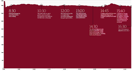
First, I didn’t understand the nature of the FTSE 100 index correctly. I drew the graph with a conventional linear y-axis:
In fact it should have a logarithmic y-axis. I barely understand the reason (it’s been nearly twenty years since I did maths) but the result would be an even less dramatic graph with the top, where the action is, squashed even more. This would make this graph even less useful on its own for telling the story of a day.
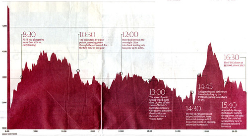
Second, lets take another look at the graph I was criticising for giving a false and over-dramatic view of the day’s market:
Of this, a few people wrote things like, “Only the financially illiterate will assume it shows an 80% fall in value; everyone will understand that it shows a large drop.” This infuriates me.
Sure, there are readers who are capable of mentally extrapolating the graph to get a representative perspective of the market. But those of us who don’t follow the markets — and I suspect paying close attention to the market is far more common in the US — those of us who don’t follow them simply aren’t going to do this. We only see market graphs at times of crisis like these and interpreting them isn’t second nature. In this context these graphs are essentially illustrations of an abstract activity and we won’t examine them more closely than we would any other picture. First impressions are all we’re going on here.
Also, dismissing people who won’t understand as “only the financially illiterate” is dismissing the majority of people. Most people have very little clue about how the market works. If you showed that first graph to a bunch of hypothetical “average” people I’d bet you few of them would be able to give you a remotely accurate estimate of the market’s potential fall.
The final theme in the comments is one I alluded to in my post: the “realistic” graph I drew underplays the importance of the market activity. Showing a 10% drop on such a graph doesn’t look like a big deal but, of course, in the market it’s huge. So a zoomed-in view does reflect better the drama of the day, which is why I suggested a combination of the two might work.
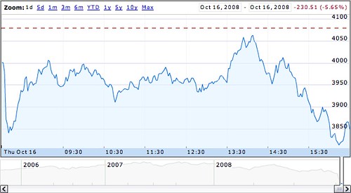
I was looking around for more examples of market graphs and came across those on Google Finance. Here’s its FTSE 100 graph for today, 16th October 2008:
The small graph at the bottom is a lovely touch. As well as a means of navigation back and forth in time it gives you more context of where we are in terms of market history. We can instantly see that yes, things really are bad compared recent years.
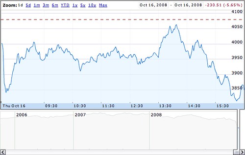
Unfortunately that secondary graph is itself dramatised and zoomed-in. You could, again, be forgiven for thinking that the market had almost reached rock bottom: you now have two graphs where the line heads straight for rock bottom. We can fix this by expanding the lower graph to be more “accurate”:
This is just a mock-up of course and applying the correct logarithmic scale would, again, compress the details even further, reducing the utility of the graph for viewing past market trends. But it’s useful information; we can confirm exactly how bad things are now compared to say, 2007.
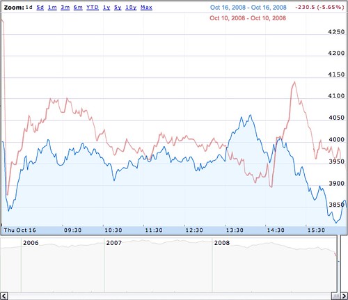
One problem remains, however. Looking at the day’s activity do you have any idea how bad it is? I heard on the news it was a bad day but, as someone who doesn’t follow the market, I have no way of putting it in perspective.
So here’s my first attempt at doing just that:
This superimposes last Friday’s activity, the graph we looked at in my last post. We can now instantly see that as bad as today was, last Friday was a bigger drop. But today we ended up with the market even lower.
I’m not sure how this would function as an interface, or how one would know what days to compare to be useful. It’s also getting more complicated and for people who have a hard time understanding the normal market graphs, this won’t be be much help.
But it’s an attempt to find a way to get some perspective on these things. At the moment we’re trying to give readers and viewers information about a big picture by only showing them one tiny corner, with no reference to past events, and expecting them to understand. The only perspective we get at the moment is talk of “the biggest drop since 1932” or similar. There must be better ways to understand both our present and past mistakes and successes.
I’ll leave you with this interesting interactive graph from the New York Times which tries to do exactly that. More please. (Thanks Ben).
Commenting is disabled on posts once they’re 30 days old.
